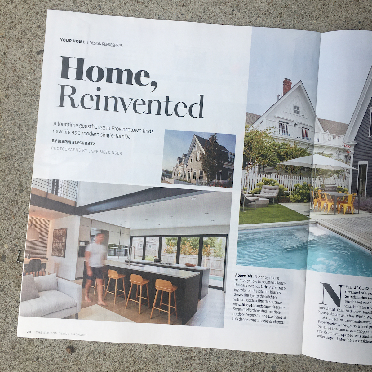
Provincetown Modern Renovation Featured in Boston Globe Magazine
“Home Reinvented: A longtime guesthouse in Provincetown finds new life as a modern single-family.” by Marni Elyse Katz for Boston Globe.
Read the full article about this Provincetown Modern Renovation. Article excerpt below.
‘I can’t believe this came out of it’: A Provincetown guesthouse gets reinvented as a modern single-family
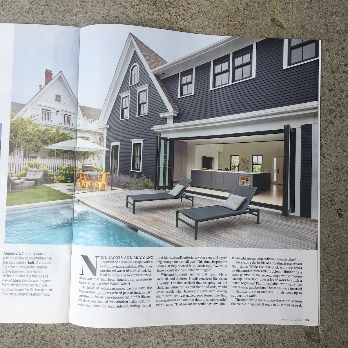
Neil Jacobs and Eric Ganz dreamed of a seaside escape with a Scandinavian sensibility. What they purchased was a historic Greek Revival built for a sea-captain-turned-merchant that had been functioning as a guesthouse since just after World War II.
As head of reconnaissance, Jacobs gave the Provincetown property a hard pass at first, in part because the house was chopped up. “It felt like every door you opened was another bathroom,” Jacobs says. Later he reconsidered, noting that it met his husband’s criteria: a water view and a yard big enough for a small pool. This time, inspiration struck. If they opened it up, Jacob says, “We could have a central atrium filled with light.”
Wife-and-husband architectural team Mette Aamodt and Andrew Plumb rendered the vision a reality. The duo realized that scooping out the shell, including the second floor and attic, would leave exactly what Jacobs and Ganz were looking for. “There are two gabled roof forms, one that runs east-west and another that runs north-south,” Plumb says. “That meant we could have two double-height spaces perpendicular to each other.”
Excavating the inside of a building is easier said than done. While the red brick chimney could be dismantled with little problem, eliminating a good portion of the second story would require backup. “The floor does a lot of work to stitch a house together,” Plumb explains. “You can’t just take it away and be done.” Steel ties were inserted to stabilize the roof and steel lintels went up to support the walls.
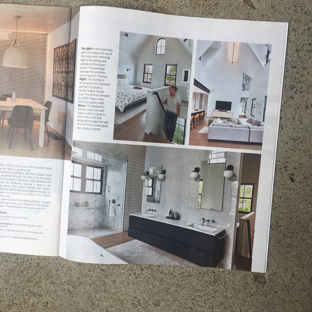
The main living space is now the central atrium the couple imagined. It soars to 22 feet at its peak and light pours in from nearly every direction. The architects matched an existing sky-high dormer window facing the street with a copycat opening on the wall across from it, which opens into the second-floor den. They also made a cutout in the wall above the stairs that peeks into the master suite. “The idea was to create these specific moments of connection between spaces,” Plumb says.
The living room melds into the kitchen at the back of the house. At Ganz’s suggestion, a 12-foot bi-fold door visually connects the space to the deck, patio, and plunge pool. In the interest of keeping sightlines clear, cabinetry and appliances are pushed to the side. “A kitchen has all this stuff that screams, ‘I am a kitchen!’” Plumb says. “It’s important that a kitchen be quiet in an open space, especially here where you look through it to the outdoors.”
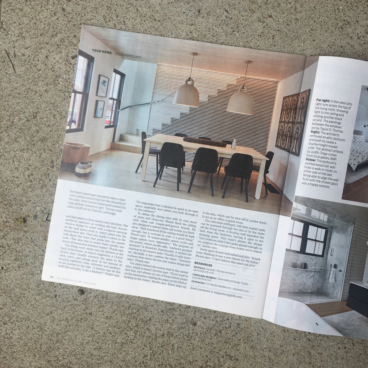
To imbue the dining area with its own sense of space and character, Plumb lined the ceiling with white oak tongue-and-groove boards. He also designed a slatted white oak screen as a backdrop. “Neil wondered if the ceiling would be high enough, but a contrast in scale is a good thing,” Plumb says. “It makes smaller spaces cozier and larger spaces more impressive.” The purpose of the screen, which Jacobs calls, “Andrew’s greatest moment,” is threefold. Functionally, it shields the stairway to the master suite. Visually, it adds interest. Mentally, it also soothes the mind. “Textured surfaces slow down the eye and makes things feel calm,” Plumb says.
